

gLike
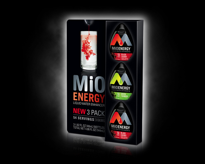
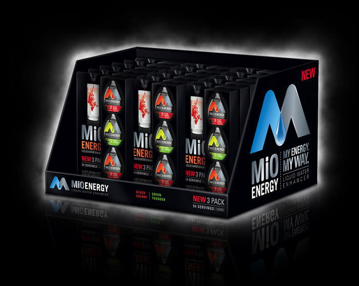
MiO Energy Adaptation Packaging and Displays
Kraft needed an "Energy" version for the 3 pack, tray and pallet skirt. They provided the base version which was everything in silver. I had to effectively get rid of all of the graphics, make the squeeze bottles look black instead of silver and then convincingly "map" the new Energy graphics. I laid-out new graphics, did the mechanicals and renders of all three.
Client: Pressproof Studio / Kraft Foods
Services Performed: Design Adaptation, Photo Retouching, Production, Digital Rendering
Software: Illustrator, Photoshop