
As a reference for developing the print surfaces, I looked at the elegant and sophisticated beauty of Victorian hand fans, the intricate patterns, motifs, subtle colours, befitting the aesthetics of the brand Elie Saab.
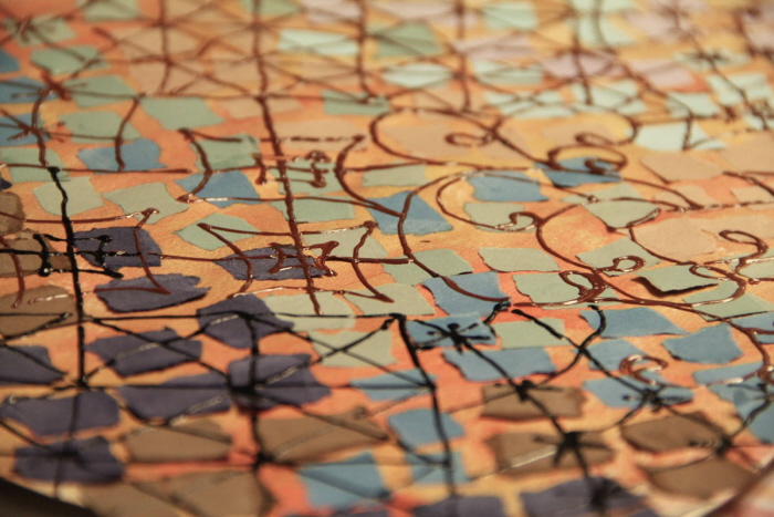
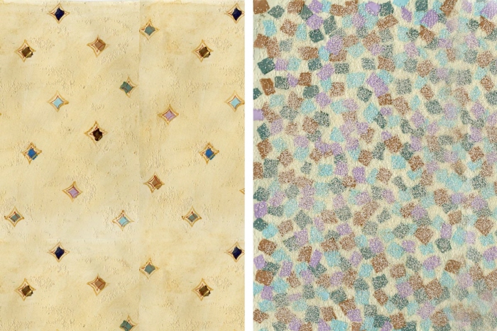
Some early explorations for the main print surface, exploring forms, colours and textures, to arrive at dynamic surfaces.

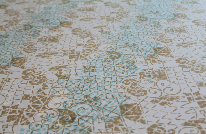
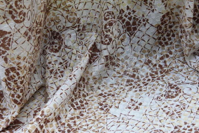
The main print surface, and the detail of the treatment for the print. An attempt has been made to keep the surface soft, elegant, yet to give it a dimension.
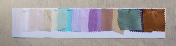
Colour palette
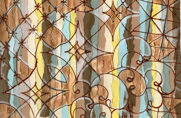
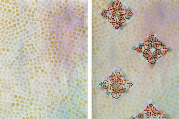
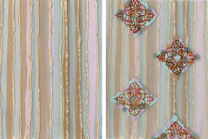
A set of surfaces developed to serve as co-ordinates to the main print surface.

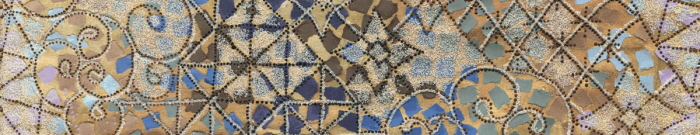
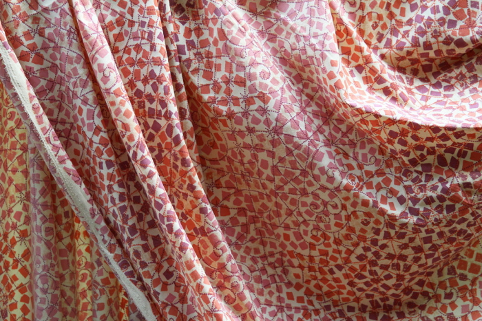
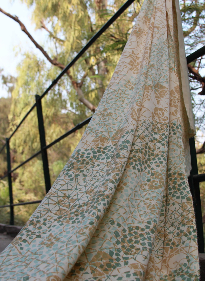
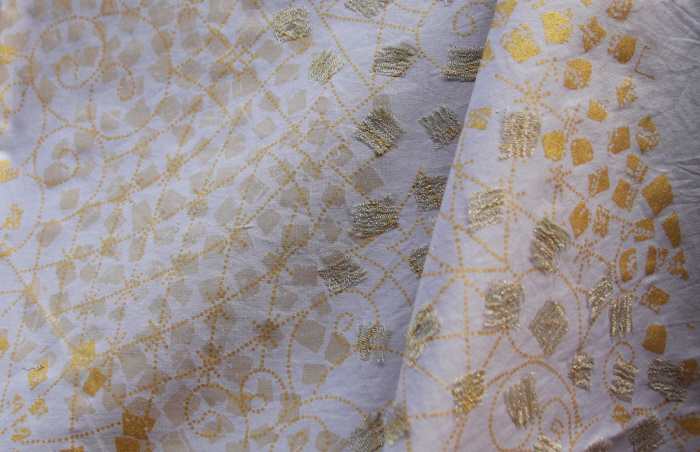
The print was further modified to be screen printed, using a maximum of 4 screens. These are some of the screen printed surfaces, with different fabrics and colour ways.
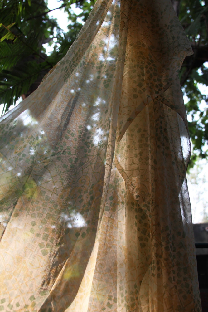
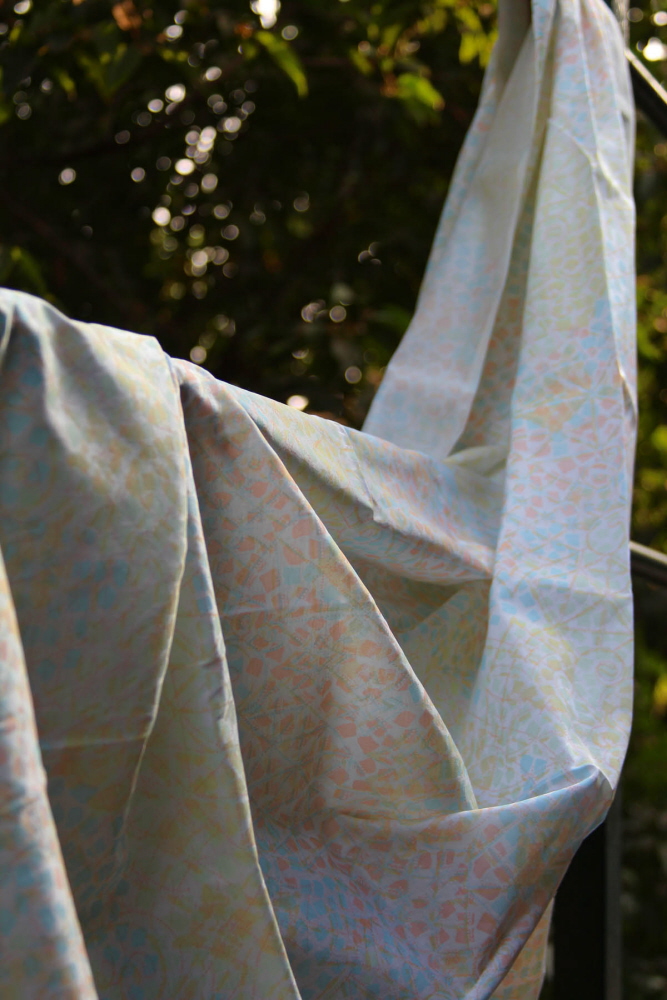
The wispy elegance of the print is emphasized when printed on chiffon.
On butter crepe.
The print in a monochromatic colour way, on a textured dobby woven cotton fabric.
Using cotton satin.
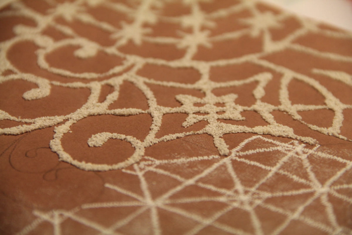
Using 2 screens and adding dimension by combining it with applique.
gLike
PRINT DESIGN
The project brief here was to develop a collection of print surfaces, adhering to the aesthetic of a particular International brand. I chose the brand Elie Saab, known for its elegance, silhouettes that capture the essence of femininity, exquisite materials, embellishments and details.