DePaul University | Booklet Covers
Booklets designed for faculty and student audiences. Both covers draw inspiration from the internal text while remaining gender and culturally neutral.

Office Place Solutions | Promotional Program
Office Place Solutions is a service/ monthly program offered by United stationers to their dealers and suppliers. The program offers print and electronic templates for web sites, eblasts, printed flyers, postcards and brochures to promote products to the dealers customers. (Firm: Teamworks Media)

Peapod | Promotional Collateral
Direct mail piece emphasizing convenience and smart shopping.

Peapod | Promotional Collateral
E-mail for TOP 5 summer campaign.

bluefusion | Logo
Bluefusion is DePaul University’s new in-house agency. This symbol (fusion shape) signifies the energy of ideas fusing together, the excitement of new ideas forming and the innovation used to form those ideas.

bluefusion | pages from branding book
Bluefusion is DePaul University’s new in-house agency. This symbol (fusion shape) signifies the energy of ideas fusing together, the excitement of new ideas forming and the innovation used to form those ideas.

bluefusion | pages from branding book
Bluefusion is DePaul University’s new in-house agency. This symbol (fusion shape) signifies the energy of ideas fusing together, the excitement of new ideas forming and the innovation used to form those ideas.

bluefusion |web page
Bluefusion is DePaul University’s new in-house agency. This symbol (fusion shape) signifies the energy of ideas fusing together, the excitement of new ideas forming and the innovation used to form those ideas.


Mintel | Backdrops for tradeshow
Mintel was looking for fresh perspective for their tradeshow backdrop. The goal was to adhere to Mintel’s young clean branding but not be to “plain.” Logo, copy and icons needed to be part of the design but notinterfere with the person standing in front of the back drop.

RILA | Snapshot of the Industry
Client: RILA (Retail Industy Leaders Association)
42 page brochure containing articles, white papers and commentary pertaining to the retail industry and RILA events during 2005. Look and feel is clean with a magazine feel. Firm: c|change

American Cancer Society | Breast Cancer Walk Survivor Gift
Created, sourced and branded the 2013 survivor gift for the American Cancer Societies Making Strides Against Breast Cancer fundraising walk. Branded Message: Making more memories with Making Strides Against Breast Cancer. This gift is a frame for the photos taken from a photo booth at the event.

American Cancer Society | Powerpoint
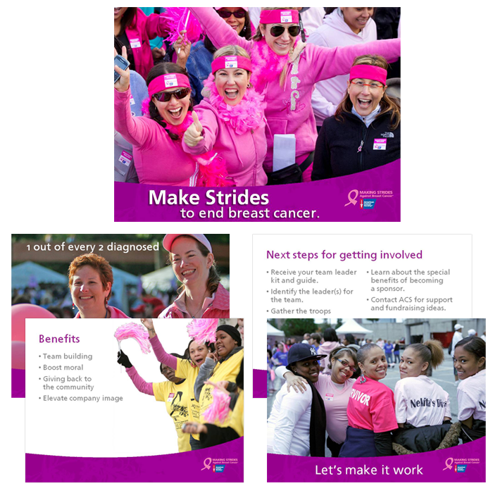
Presentation created to convince potential corporate clients to participate in the American Cancer Society’s Making Strides Against Breast Cancer fund-raiser with potential to become a sponsor. (sample pages from a larger deck)

The Second City | Collateral
Calendar for Second City employees, video banners, ad slicks and souvenir poster all designed adhering to The Second City's Branding Standards.

Animated Banner Ads
Banner ads created for political campaigns (Firm: Compass-Media)

Animated Banner Ads
Banner ads created for political campaigns (Firm: Compass-Media)

Travis-Pedersen & Associates | Website Redesign | inner page
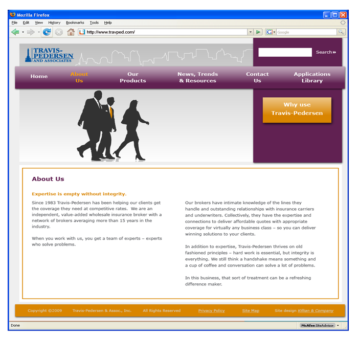
The redesign creates an update up look. The goal was to feature Travis-Pedersen as a company of customer oriented, experienced brokers ready to assist client needs. http://www.travped.com/

Travis-Pedersen & Associates | Website Redesign | Home page
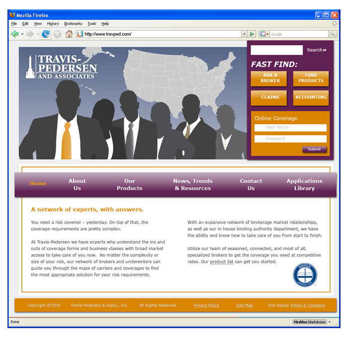
The redesign creates an update up look. The goal was to feature Travis-Pedersen as a company of customer oriented, experienced brokers ready to assist client needs. http://www.travped.com/

Travis-Pedersen Insurance | Sell Sheets
The redesign creates an update up look. The goal was to feature Travis-Pedersen as a company of customer oriented, experienced brokers ready to assist client needs.

Logos & Type Treatments
1. Metastatic Breast Cancer Network
2. National Metastatic Breast Cancer Awareness Day
3. Chicago Realty

Logos & Type Treatments
1. Donny’s Skybox Studio
2. bluefusion

Logos & Type Treatments
1. Sprecher Soda flavors
2. John Dough’s Bakery
3. Armadillo Press

The Mark Makers | Book
Commemorative stamp book. Design has a clean look with inviting pages throughout the book.

Sprecher Brewery Gourmet Soda Redesign
Redesign is upscale and clean creating strong eye appeal on the shelf as well as illustrating the 'gourmet' nature of the product.

INA Typeface & Promotional Package
Typeface inspired by a fellow colleague, Irina and Art Deco typefaces. Promotional package is a game using the letter forms as game pieces.
gLike