Early logo concepts. The client wanted the design to feature a Japanese maple tree and have an architectural feel.
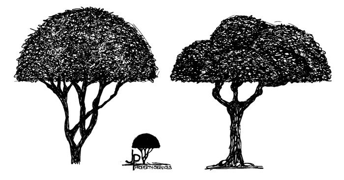
Updated Japanese maple tree drawings. Revisions based on client feedback.
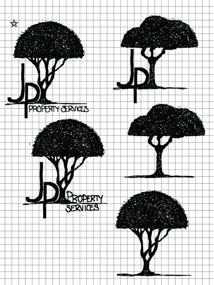
Refined concepts using the updated Japanese maple tree drawings.
Final revision. The client requested that "JP's" be included at the bottom and their phone number be added.
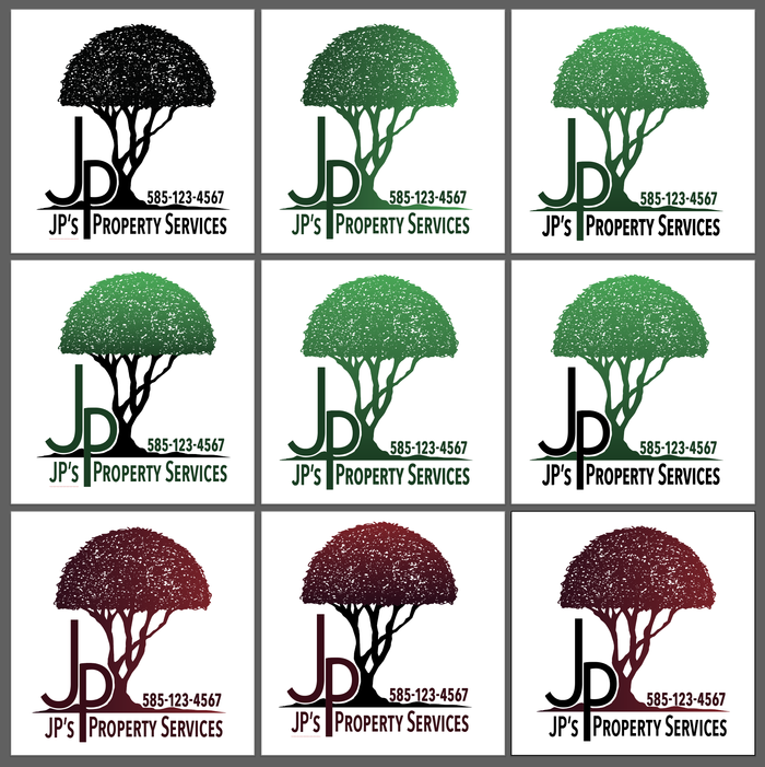
Color studies.
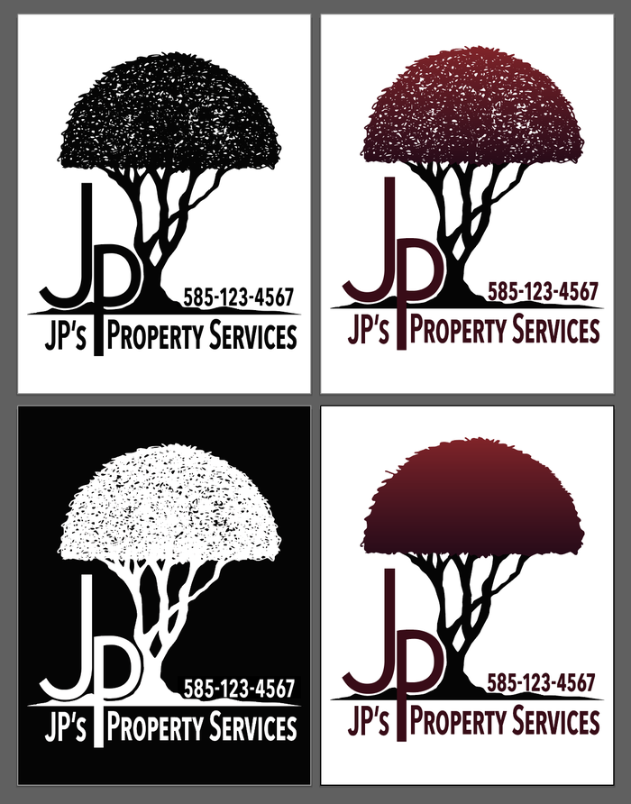
Final logo. Per the client's request, a simplified version (bottom right) was created for use in embroidery.
gLike
Logo Design: JP's Property Services

The logo for JP's Property Services is a simple and elegant design that features a manicured Japanese maple tree. It is rendered in a modern style and utilizes a limited color palette making it easy to remember and recognize. The logo is versatile enough to be used in a variety of marketing materials and applications.

Available
Freelance, Full-time, Moonlighting
Megan Wallace Searle
Multi-faceted designer with e-commerce, and administrative experience Rochester, NY