


Align expressiveness and sophistication, emotion and modernity into a superior and intelligent design.
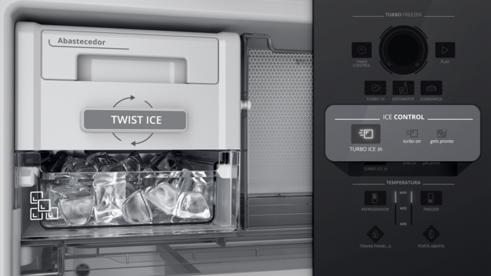
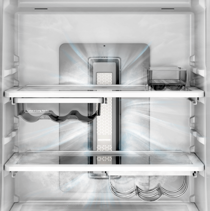
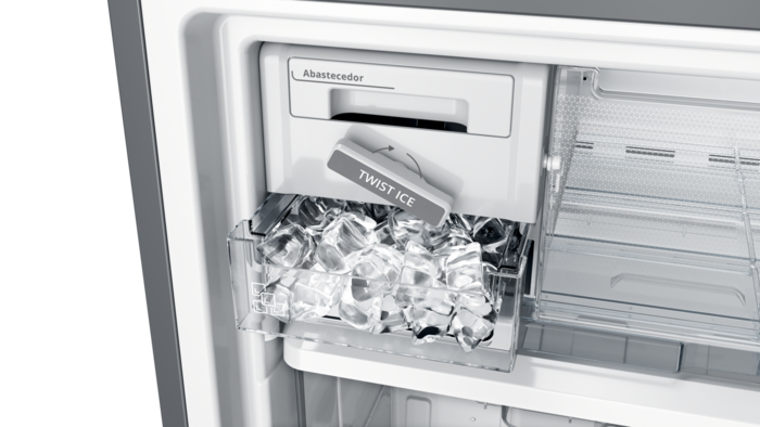
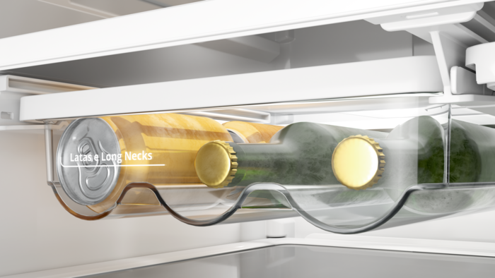
Potentialize effects and costs by investing into strategic and relevant finishes. Some of the examples were the handle on brushed steel and the UI in dark mirror (a sophisticated color created exclusively for the new Brastemp line). The frosted patterns strategic were placed to bring expressiveness and internal refinement. The light tower is another key point of the CFM strategy, it is unique and sophisticated. The UI design was another important part of the project. It was very complex to align electronics to the segmentation strategy of the product taking the user experience very serious in all the details. The refinement and aligned language between all the product + design of the icons and interaction were wide work fields in a partnership to other Whirlpool teams as engineers and ux.